Data Analysis For Product Managers
An interview with our user about a product decision he made.
It was 2019, they were convinced that their users desperately needed a social sharing feature. Why? Because every competitor had one. Because it felt right.
They spent three months building it. Beautiful UI, smooth animations, the works. Launch day came, and no one using it. Less than 2% of users even clicked on it. The feature they’d prioritized over everything else was gathering digital dust while their support tickets screamed about actual problems we’d ignored.
That’s when data analysis stopped being optional for them. It became survival.
Here’s the uncomfortable truth: your gut instinct is probably wrong about half the time. But data? Data doesn’t care about your ego or your favorite feature idea. It just tells you what’s actually happening.
So yeah, let’s talk about data analysis for product managers, not the theoretical stuff you’d learn in a statistics course, but the practical, messy, real-world skills that’ll stop you from building features nobody wants.
And you can simply done it with Livedocs. Livedocs is an advanced AI agent for data analysis, from question to result in seconds.
Why Product Managers and Data are inseparable
You can technically function without coffee in the morning. You’ll just make worse decisions, move slower, and probably annoy everyone around you.
Same goes for product management without data analysis.
The thing is, product management sits at this weird intersection. You’re not a data scientist (Jupyter notebooks give non tech people anxiety). You’re not a data analyst either. But you need enough fluency to ask the right questions, interpret the answers, and make decisions that don’t crash and burn.
One VP at Duolingo put it perfectly: it’s not just about seeing a metric go up, it’s understanding why it’s going up and what user behavior changed. That’s the skill that separates mediocre PMs from great ones.
And honestly? The companies crushing it right now aren’t the ones with the fanciest algorithms. They’re the ones where product managers can look at data, spot patterns, and ship improvements before their competitors even notice the problem.
It’s understanding why it’s going up and what user behavior changed
Data Intuition Beats SQL Skills
Controversial take incoming: you don’t need to be a SQL expert to be a great product manager.
Most experienced PMs agree that their key skill is data intuition, the ability to make inferences about users and business value based on data. SQL and other technical skills are handy, especially at smaller companies without dedicated analytics teams, but they’re not make-or-break.
What’s data intuition? It’s pattern recognition on steroids. It’s looking at a graph of user retention and immediately thinking, “Wait, why did cohort behavior change in March?” It’s seeing that power users spend 80% of their time in two features and realizing those features deserve 80% of your development attention.
Think of it this way: SQL helps you get the data. Data intuition helps you know what data to get in the first place and what it means once you have it.
That said, learning basic SQL has been one of the best investments I’ve made. Not because I use it every day, but because I can answer my own questions without waiting three days for the analytics team to get back to me. In startup land, that speed matters.
The Core Data Skills That Actually Matter
Let’s break down what you really need to know, ranked by importance:
1. Understanding User Behavior Through Data
This is the foundation. Everything else builds on it. You need to look at usage patterns and understand what users are actually doing, not what they say they’re doing in surveys, not what you hope they’re doing, but the cold hard reality of their clicks, time spent, and drop-off points.
Questions you should be able to answer:
- Which features do my active users touch most frequently?
- Where do users get stuck or frustrated?
- What behaviors correlate with long-term retention?
- How do different user segments behave differently?
The beautiful thing about behavioral data is that it doesn’t lie. Users might tell you they love Feature X in an interview because they want to be helpful. Their actual usage data will tell you they haven’t touched it in weeks.
2. Defining and Tracking the Right Metrics
If you’re measuring everything, you’re measuring nothing. Sounds harsh, but it’s true.
Start by clearly defining what you want to achieve, understanding user behavior, improving engagement, measuring feature success, or identifying pain points. Then choose the specific metrics that’ll tell you if you’re succeeding.
This is harder than it sounds. Early in our career, we obsessed over page views. Turns out page views are a terrible metric for a SaaS product where success means users accomplish tasks efficiently. High page views might actually mean your UX is confusing and people can’t find what they need.
Better metrics for most products:
- Activation rate (users reaching their first moment of value)
- Engagement frequency (how often users return)
- Feature adoption rates
- Retention cohorts
- Customer satisfaction scores tied to specific workflows
The key is making sure your metrics ladder up to actual business outcomes. Don’t track metrics just because they’re easy to track.
3. Designing and Interpreting Experiments
A/B testing isn’t just for growth hackers anymore. It’s table stakes for product managers who want to make evidence-based decisions. But here’s what trips people up: designing a good experiment is way harder than running one.
You need to:
- Formulate a clear hypothesis (not “let’s try this button in blue” but “users will convert better with a blue CTA because it creates higher contrast”)
- Determine what success looks like before you start
- Understand statistical significance (a 5% improvement with 50 users means nothing; with 5,000 users it might be real)
- Account for confounding variables
- Know when to kill an experiment that’s going nowhere
We’ve seen product teams run A/B tests for months without enough traffic to reach significance. That’s not experimentation, that’s just wasting time with extra steps.
4. Translating Data Into Stories
You know what nobody cares about? Your data analysis.
Nobody cares about the analysis itself. They care about what it means and what they should do about it.
A core PM skill is translating complex findings into simple, actionable narratives using clear visuals and storytelling techniques. Your job isn’t to dump spreadsheets on stakeholders. It’s to say: “Here’s what’s happening, here’s why it matters, and here’s what we should do next.”
This is where most analytically-minded PMs fall short. They create these incredibly detailed dashboards with 47 different cuts of the data, but they can’t explain to the CEO in two minutes why we should prioritize Feature A over Feature B.
Practice distilling your insights. “Our retention drops 40% after day 7, primarily among users who haven’t connected their team. We should focus on improving the team invitation flow” beats a twenty-slide deck any day.
5. Balancing Quantitative and Qualitative Data
Here’s something that took me way too long to learn: numbers tell you what is happening, but not why.
You see a spike in churn. Quantitative data tells you when it started and which user segments are affected. But qualitative data, user interviews, support tickets, session recordings, tells you that users are leaving because your new navigation confused them.
You need both. Always.
Some of my best product insights came from reading support tickets for an hour and noticing the same frustration mentioned seventeen different ways. That pattern sent me to the quantitative data to validate how widespread the issue was.
The reverse works too. Quantitative data shows you where to investigate; qualitative data shows you what you’re looking at.
Common Data Analysis Pitfalls (And How to Avoid Them)
The Vanity Metrics Trap
Total users, page views, downloads, these numbers feel good, but they rarely tell you anything useful about product health.
Ask yourself: if this number went up 20% tomorrow, would it definitely mean my product is better? If the answer is “not necessarily,” you’re probably tracking a vanity metric.
Focus on metrics tied to real value creation and business outcomes instead.
Correlation Isn’t Causation
Users who use Feature X have 2x better retention. Great! Let’s push everyone to use Feature X!
Hold up. Maybe the type of user who chooses to use Feature X is already more engaged. Maybe Feature X doesn’t cause retention, maybe high engagement causes both Feature X usage and retention.
This mistake is so common it hurts. Before you decide Feature X is magical, run an experiment where you actively push a random group of users to try it and measure if their behavior actually changes.
Death by Dashboard
We love a good dashboard as much as the next PM. But if you spend more time updating dashboards than using the insights they provide, something’s wrong.
Keep your core metrics dashboard simple. Five to seven key metrics maximum. Everything else can live in deeper-dive reports you pull when needed.
The goal isn’t to have the prettiest graphs. It’s to make better product decisions faster.
Ignoring Small Sample Sizes
“We interviewed five users and they all hated the redesign!”
Okay, but you have 50,000 users. Five isn’t statistically meaningful. It’s worth investigating, but it’s not proof of anything.
Same goes for A/B tests. That 12% improvement in conversion might disappear when you get more traffic. Understand statistical significance and confidence intervals, even if just at a basic level.
The Data Analysis Workflow That Actually Works
After years of trial and error, here’s the framework I use:
1. Start with the question, not the data
What decision are you trying to make? What do you need to know? Getting clear on this saves hours of pointless analysis. Bad: “Let me look at all our engagement data.” Good: “Which onboarding steps correlate with long-term retention, so we know what to optimize?“
2. Identify the metrics that’ll answer your question
Sometimes this is obvious. Sometimes you need to get creative or combine multiple metrics to see the full picture.
3. Get the data (or ask someone to get it)
If you know SQL, great, query away. If not, work with your analytics team. Be specific about what you need and why.
4. Analyze and look for patterns
This is where data intuition shines. Don’t just look at averages, check segments, cohorts, outliers. The interesting insights often hide in the edges of your data.
5. Validate with additional data sources
Cross-reference quantitative findings with qualitative feedback. Do they tell the same story?
6. Form a hypothesis and test it
Don’t just report findings. Propose what you think is happening and how to verify it.
7. Make a decision and measure the outcome
Ship the change, then watch what actually happens. Did your analysis predict reality? If not, what did you miss? This isn’t a one-time thing. It’s a continuous loop that gets faster as you build your data intuition.
How Livedocs Simplifies Data Analysis for Product Managers
Okay, real talk: most product data problems come down to two things, access and making sense of it all.
Your data is everywhere. Mixpanel. Amplitude. Google Analytics. Your database. Stripe. Support tickets. To answer one simple question, you’re hopping between a dozen tabs, copying numbers into spreadsheets, and hoping nothing breaks along the way.
And after all that? You ship a static report that’s already outdated the moment you share it.
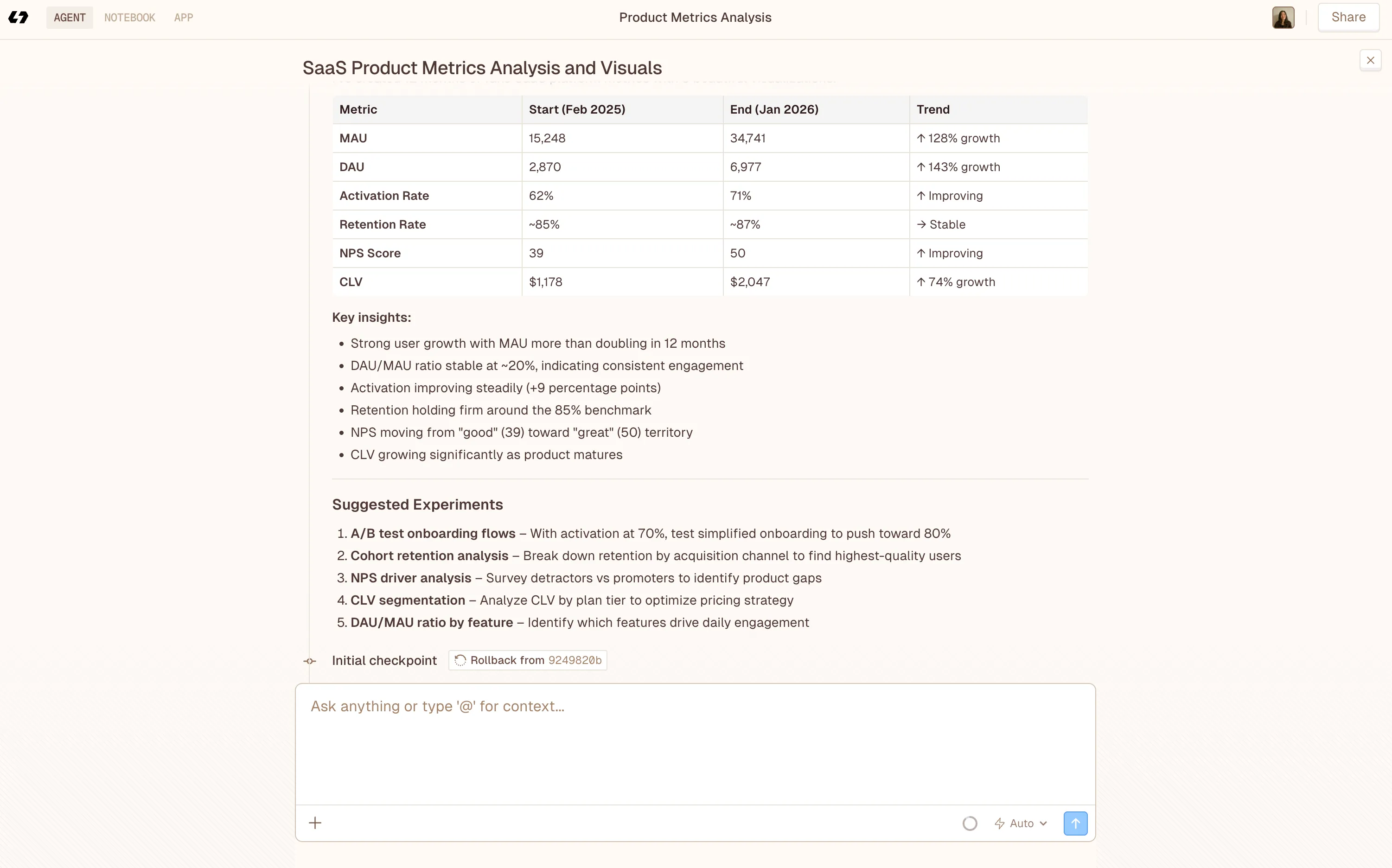
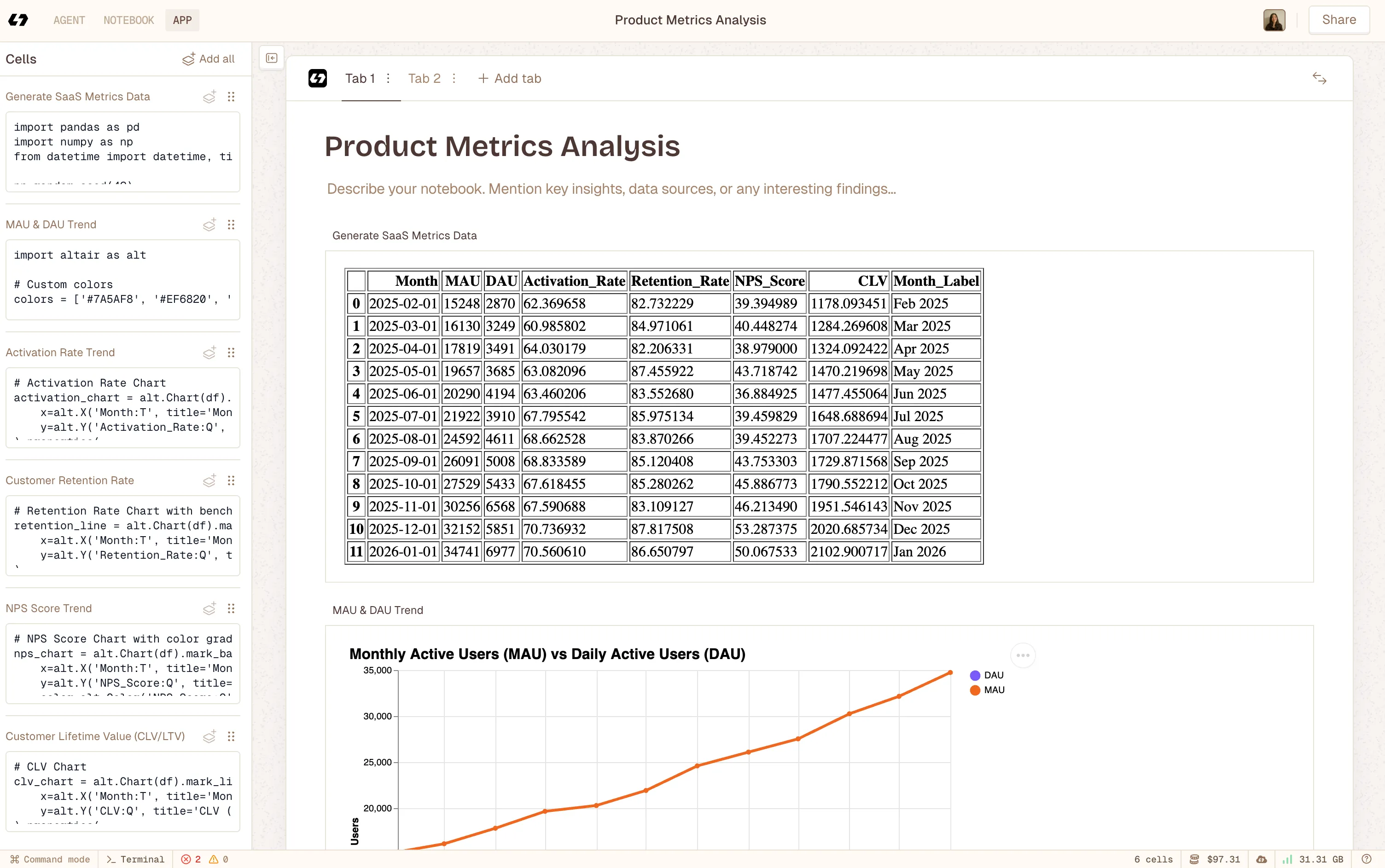 Using Livedocs to build notebook app after deep analysis with Livedcs Deep Agent.
This is where Livedocs actually makes life easier for product teams. Instead of building dashboards or fighting with SQL, you pull live data from all your tools straight into a shared document. One place. Always up to date.
Want your key metrics sitting right next to your product strategy? Easy. Want to show how activation changed after a feature launch? Connect your analytics and the numbers update automatically. Want the whole team looking at the same data without managing dashboard access? Done.
What I really like about this approach is the context. Instead of a cold dashboard that just says “Retention: 73%,” you can explain what that number means, why it matters right now, what changed last quarter, and what you’re doing about it. The data and the story live together.
The AI help is a big win too. Not everyone on a product team wants to write queries or fuss over charts, and they shouldn’t have to. With Livedocs, you can ask questions in plain English and get back charts, tables, and insights without being a data expert.
For PMs who need to move fast (so… all of us), having live data, shared context, and strategy in one place is huge. Less time wrangling numbers, more time actually making decisions.
And when an exec asks, “What’s driving growth this quarter?” in the middle of a meeting, you can open a living doc with real-time data, instead of scrambling through slides from last week that are already wrong.
Advanced Techniques
Once you’ve mastered the basics, these techniques can seriously upgrade your analytical game:
Cohort Analysis
Instead of looking at all users as one blob, segment them by when they signed up (or any other attribute) and track how different cohorts behave over time.
This reveals whether your product is actually getting better. If your April cohort has better retention than your January cohort, something you changed between those months worked. Time to figure out what.
Funnel Analysis
Map out the critical paths users take through your product and identify where they drop off. Every funnel has leaks, the question is where and why.
I once discovered that 40% of users abandoned our signup flow on the credit card page. That’s not a credit card problem, that’s a “we’re asking for payment too early” problem. Moved it later in the flow, conversion jumped 25%.
Predictive Analytics
Use historical data to forecast future behavior. Which users are most likely to churn next month? Which prospects are most likely to convert?
This gets technical fast, so you’ll probably need data science support. But even basic predictive models can focus your efforts where they’ll have the most impact.
Sentiment Analysis
For products with user-generated content or lots of customer feedback, sentiment analysis helps you process thousands of comments to identify patterns in how users feel about your product. It’s not perfect, but it beats reading 10,000 app reviews manually.
Building Your Data Muscle Memory
Data analysis is a skill, and like any skill, you get better with practice.
Start small. Pick one metric you care about and really understand it. Where does the data come from? What behaviors drive it up or down? What confounding factors might be hiding in there?
Then expand. Add another metric. Start running simple experiments. Learn basic SQL if you’re motivated (Khan Academy and Mode Analytics have great free tutorials).
Ask questions constantly. Why did that number change? What would happen if we changed this? How do different user segments compare? The curiosity matters more than the technical chops.
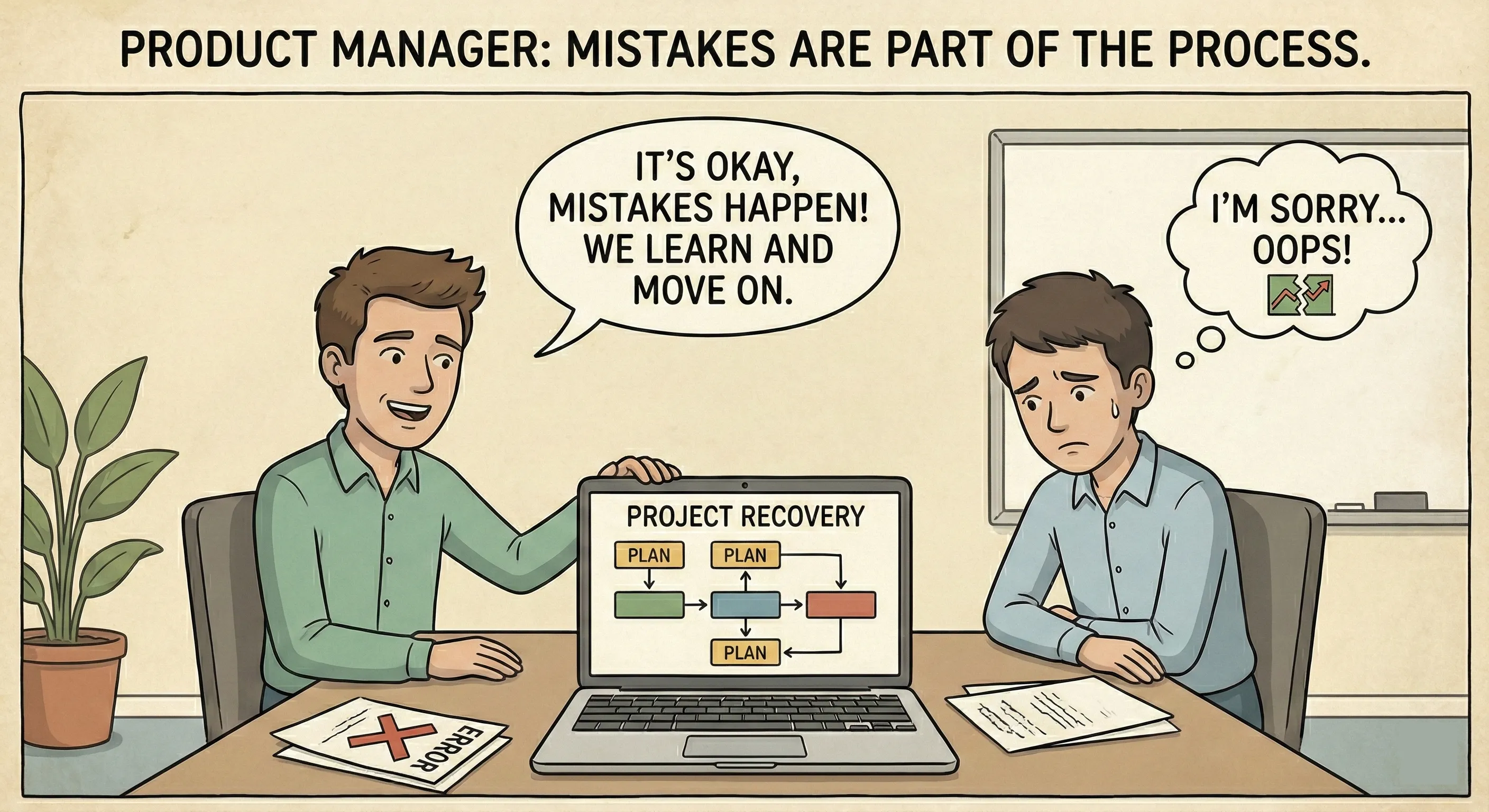
And honestly? Don’t be afraid to get it wrong. I’ve made countless bad calls based on misinterpreting data. Each mistake taught me something about where my blind spots were.
Data-Informed vs. Data-Driven (There’s a Difference)
One last thing before we wrap up.
Being data-informed means using data as a critical input to your decision-making. Being data-driven means letting the data make every decision for you.
The first is smart. The second is dangerous.
Data can’t tell you which problem to solve. It can’t tell you what’s technically feasible or strategically important. It can’t account for long-term vision that requires short-term metrics to dip.
Sometimes the data says “don’t build this” but you need to build it anyway because it’s setting up a play that won’t show results for six months.
Use data to inform your decisions, challenge your assumptions, and measure outcomes. But don’t outsource your judgment to it.
Your job as a product manager is to synthesize data with user empathy, business strategy, technical constraints, and competitive positioning. The data is one crucial input, not the only input.
Final Thoughts
Data analysis for product managers isn’t about becoming a statistician or a programmer. It’s about building enough fluency to ask smart questions, interpret the answers correctly, and make better decisions faster than your competition.
Start with the basics: understand user behavior, define the right metrics, run simple experiments, and tell clear stories with your findings. Get comfortable with the tools your company uses. Learn to balance numbers with human insight.
The best, fastest agentic notebook 2026? Livedocs.
- 8x speed response
- Ask agent to find datasets for you
- Set system rules for agent
- Collaborate
- And more
Get started with Livedocs and build your first live notebook in minutes.
- 💬 If you have questions or feedback, please email directly at a[at]livedocs[dot]com
- 📣 Take Livedocs for a spin over at livedocs.com/start. Livedocs has a great free plan, with $10 per month of LLM usage on every plan
- 🤝 Say hello to the team on X and LinkedIn
Stay tuned for the next article!
Ready to analyze your data?
Upload your CSV, spreadsheet, or connect to a database. Get charts, metrics, and clear explanations in minutes.
No signup required — start analyzing instantly