How To Analyse 10000+ Rows Excel Data
“Can you find patterns in this?”
“Maybe some insights?”
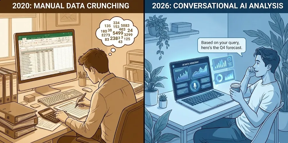
And you’re sitting there thinking about the next three hours, scrolling through endless rows, creating pivot tables, and trying to remember which VLOOKUP formula doesn’t break everything.
Here’s the thing: we’re in 2026, and you shouldn’t have to do that anymore.
Why 10,000 Rows Is A Disaster
Don’t get me wrong, Excel is great. I’ve spent probably years of my life in it. But there’s this threshold, somewhere around 5,000 to 10,000 rows, where things start getting painful.
Your pivot tables slow down. Your formulas take forever to recalculate. You start using CTRL+F more than you’d like to admit because you can’t remember which column has what. And forget about spotting patterns visually, you’re basically spending 10 hours on a basic task.
The real problem isn’t Excel itself. It’s that Excel wasn’t designed for exploratory analysis at scale. It’s a spreadsheet tool, not an analysis platform. You end up doing manual work that, honestly, AI can handle way better and way faster.
What AI Actually Brings to the Table
When I say “analyze with AI,” it’s not about replacing data analyst. It is talking about having a really smart assistant that can:
- Spot patterns you’d never notice scrolling through rows
- Generate summary statistics in plain English instead of formulas
- Create visualizations automatically based on what makes sense for your data
- Answer questions about your data in natural language
- Flag anomalies and outliers without you having to define what “normal” looks like
Think of it like this: instead of you translating business questions into Excel formulas, you just ask the question. “Which products had unusual sales spikes last quarter?” “Are there any customer segments we’re missing?” “What’s driving our costs up?”
The AI figures out how to query the data and presents you with answers. And this isn’t some distant future thing, this is what platforms like Livedocs are doing right now.
Getting Your Data AI-Ready
Before we jump into the fun stuff, let’s talk about prep work. Your Excel file probably isn’t in perfect shape, and that’s fine. Most real-world data is messy. But there are a few things that’ll make your life easier.
First, check your headers. AI works best when your columns have descriptive names. “Q1_Sales_2024” is way more useful than “Column_B.” You’d be surprised how much better results you get just from having clear column names.
Second, look for obvious formatting issues. Are dates actually formatted as dates, or are they text that looks like dates? Are your numbers stored as numbers, not text with commas? These little things trip up even smart AI.
Third, think about what’s actually in those 10,000 rows. Are they individual transactions? Customer records? Website visits? Understanding the grain of your data helps you ask better questions later.
Here’s a quick Python snippet I use to get a sense of what I’m dealing with:
import pandas as pd

# Load your Excel file
df = pd.read_excel('your_massive_file.xlsx')

# Quick health check
print(f"Total rows: {len(df)}")
print(f"Total columns: {len(df.columns)}")
print("\nColumn names and types:")
print(df.dtypes)
print("\nMissing values:")
print(df.isnull().sum())
print("\nFirst few rows:")
print(df.head())
In Livedocs, you don’t even need to remember these commands. You just upload your Excel file and ask, “What’s in this dataset?” The AI will tell you, including things like “Your ‘Order_Date’ column is stored as text and should probably be converted to dates.”
In Livedocs, you don’t even need to remember these commands.
Your First AI Analysis
Let’s start with something straightforward. Say you’ve got a sales dataset with 10,000 transactions. You want to know basic things like total revenue, average order value, top-performing products, the stuff you’d normally build a dashboard for.
In the old world, you’d be creating pivot tables, maybe some SUMIFS formulas, definitely some charts. It’s not hard, but it’s tedious and error-prone.
With AI in Livedocs, you literally just ask:
“What are my total sales, and which products are performing best?”
The AI will:
- Identify the relevant columns (probably “Sales_Amount” and “Product_Name”)
- Calculate totals and rankings
- Generate appropriate visualizations
- Present everything in plain English with the charts embedded
Here’s what that looks like behind the scenes if you wanted to do it yourself:
# What the AI is essentially doing for you
import pandas as pd
import matplotlib.pyplot as plt

df = pd.read_excel('sales_data.xlsx')

# Total sales
total_sales = df['Sales_Amount'].sum()
print(f"Total Sales: ${total_sales:,.2f}")

# Top products
top_products = df.groupby('Product_Name')['Sales_Amount'].sum().sort_values(ascending=False).head(10)

# Visualize it
plt.figure(figsize=(12, 6))
top_products.plot(kind='barh')
plt.xlabel('Total Sales ($)')
plt.title('Top 10 Products by Revenue')
plt.tight_layout()
plt.show()
But you don’t write any of that. You just ask the question, and the analysis happens. The real magic is that you can immediately follow up with another question: “Why did Product X perform so well?” And the AI will dig deeper, maybe looking at regional data, time periods, customer segments, whatever’s in your dataset.
Pattern Recognition
Let’s say you’re looking at customer data, 10,000 customers with purchase history, demographics, support tickets, whatever. You want to find segments or patterns, but you don’t know what you’re looking for yet.
This is where traditional Excel completely falls apart. You could spend days creating different pivot tables and charts, hoping to spot something interesting. Or you could ask the AI: “Are there any interesting customer segments in this data?”
The AI will run clustering algorithms, correlation analyses, and other statistical methods you’d normally need a data scientist for. Then it’ll come back and say something like:
"I found three distinct customer segments:
1. High-value, infrequent buyers (8% of customers, 40% of revenue)
2. Regular small purchasers (75% of customers, 45% of revenue)
3. Churned customers who haven't purchased in 6+ months (17% of customers)"
And it’ll show you the visualizations and characteristics of each segment automatically.
I used this exact approach last month on a customer dataset, and we found a segment of high-value customers we were basically ignoring in our marketing. They had different behaviors than our typical customer, and we only spotted it because the AI flagged the pattern.
The Real Skill Is Asking Better Questions
You know what nobody tells you about AI-powered analysis? The tool is only as good as your questions. Garbage questions get garbage answers, even with amazing AI.
I’ve learned to ask questions in layers, starting broad and getting more specific:
Layer 1 - Discovery:
- “What’s interesting about this data?”
- “Are there any anomalies or outliers?”
- “What are the strongest correlations?”
Layer 2 - Hypothesis:
- “Is there a relationship between customer age and purchase frequency?”
- “Do sales spike on certain days or seasons?”
- “Which factors predict customer churn?”
Layer 3 - Action:
- “Which customers should we target for retention campaigns?”
- “What inventory levels do we need for next quarter?”
- “Where should we focus our marketing spend?”
In Livedocs, this conversational approach works beautifully because the platform maintains context. It remembers what you’ve already asked and builds on previous analysis. You’re not starting from scratch every time, you’re having an ongoing conversation with your data.
Handling Missing Data and Outliers
Real-world data is never clean. Your 10,000 rows probably have some missing values, some obvious errors (like a sale amount of $0.01), and some things that just don’t make sense.
Here’s how AI helps with that:
# Traditional approach - you write all this
df = df.dropna(subset=['Critical_Column'])
df = df[df['Sales_Amount'] > 0]
Q1 = df['Sales_Amount'].quantile(0.25)
Q3 = df['Sales_Amount'].quantile(0.75)
IQR = Q3 - Q1
df = df[~((df['Sales_Amount'] < (Q1 - 1.5 * IQR)) | (df['Sales_Amount'] > (Q3 + 1.5 * IQR)))]

# AI approach - you just ask
# "Clean this data and remove obvious outliers"
The AI will identify issues, suggest corrections, and apply them. More importantly, it’ll explain what it did and why, so you’re not blindly trusting a black box.
I had a case where our sales data included some test transactions from when we were setting up our system. They were throwing off all our averages. I asked the AI to “find and exclude any transactions that look like test data,” and it correctly identified them based on patterns like round numbers, unusual timestamps, and customer IDs that didn’t match our format.
Advanced Analysis Without the PhD
Let me show you something that would’ve required a statistics degree not too long ago. Let’s say you want to forecast future sales based on your historical data.
Traditionally, you’d need to:
- Understand time series analysis
- Choose the right model (ARIMA? Prophet? Exponential smoothing?)
- Implement it in Python or R
- Validate your model
- Generate predictions
- Create visualizations
With AI in platforms like Livedocs, you ask: “Predict sales for the next quarter based on historical trends.”
Behind the scenes, something like this happens:
from prophet import Prophet
import pandas as pd

# Prepare data
df = pd.read_excel('sales_data.xlsx')
df_prophet = df.rename(columns={'Date': 'ds', 'Sales': 'y'})

# Fit model
model = Prophet(yearly_seasonality=True, weekly_seasonality=True)
model.fit(df_prophet)

# Make predictions
future = model.make_future_dataframe(periods=90)
forecast = model.predict(future)

# Plot results
model.plot(forecast)
But you don’t need to know any of that. The AI handles the technical details, and you get a clear forecast with confidence intervals explained in plain English.
Honestly? This is one of my favorite use cases. I can run sophisticated analyses that would’ve taken me hours of research and coding in literally seconds.
Combining Multiple Excel Files
Here’s a real scenario: you’ve got sales data in one file, customer data in another, and product information in a third. Each one has 10,000+ rows. You need to analyze them together.
In Excel, you’re looking at VLOOKUP/INDEX-MATCH nightmares, or maybe Power Query if you’re fancy. It works, but it’s fragile and hard to maintain.
With AI, you can upload all three files and say: “Join the sales data with customer data using Customer_ID, then add product categories from the product file.”
The AI will:
- Identify the appropriate join keys
- Check for data quality issues (duplicate IDs, missing values)
- Perform the joins
- Let you know if there are any problems
Then you can ask questions that span all three datasets: “Which customer segments buy which product categories most often?”
Real-Time Collaboration That Actually Works
You know what’s frustrating? Emailing Excel files back and forth. “Can you check my analysis?” “I made some changes, here’s version 3.” “Wait, which version are we using now?”
This is where Livedocs becomes genuinely useful beyond just the AI features. Multiple people can work on the same analysis simultaneously. Your colleague can see your work, add their own questions to the AI, create additional visualizations, all without stepping on each other’s toes.
I’ve been in situations where we’re on a video call, looking at data together, and someone asks a question we didn’t anticipate. Instead of saying “let me analyze that and get back to you,” you just type the question into Livedocs right there, and everyone sees the answer in real-time.
The AI becomes a shared resource for the whole team, not just whoever knows Python or SQL.
When to Trust the AI
Let’s be real for a second. AI is powerful, but it’s not infallible. I’ve seen it make mistakes, and you need to know when to double-check its work.
Trust the AI for:
- Data cleaning and preparation
- Standard statistical analyses
- Pattern recognition in large datasets
- Generating visualizations
- Explaining technical concepts
Be skeptical when:
- Results seem too good to be true
- The AI is making business recommendations (it doesn’t know your context)
- Working with sensitive data (always verify calculations)
- The stakes are high (financial reports, legal documents, etc.)
I always do a sanity check. If the AI says total revenue is $50 million but you know the company only did $10 million last year, something’s wrong. Maybe it’s counting returns as sales, or including tax, or pulling from the wrong column.
The AI is a tool, not a replacement for your judgment. Use it to work faster and deeper, but keep your brain engaged.
Practical Tips That Actually Save Time
After doing this for a while, here are some things I’ve learned:
Start with a summary.
Before diving into specific questions, ask “Summarize this dataset for me.” You’ll catch data quality issues early and get context for better questions.
Be specific about what you want.
“Analyze sales” is vague. “Compare sales by region and identify which regions grew fastest year-over-year” is specific and actionable.
Ask for explanations.
Don’t just get numbers, ask “why?” The AI can often identify contributing factors you wouldn’t have considered.
Use follow-up questions.
The best insights come from drilling down. “That’s interesting, but what’s driving that pattern?” or “Show me the opposite, which customers decreased their spending?”
Export what matters.
Once you have good insights, export them to share. But keep the interactive analysis in Livedocs so people can explore further if needed.
From Analysis to Action
Here’s the ultimate test of any analysis tool: does it help you make better decisions faster?
I worked on a project where we needed to optimize our inventory across 50 locations. We had sales data (12,000 rows), inventory levels (15,000 rows), and supply chain information (8,000 rows). In the old world, this would’ve been a multi-week project for a data team.
Using AI in Livedocs, we:
- Uploaded all three datasets
- Asked about current inventory efficiency
- Identified locations with too much or too little stock
- Forecasted demand by location
- Generated reorder recommendations
Total time: about four hours, including review and validation. The recommendations led to a 15% reduction in holding costs and fewer stockouts.
That’s the real value. Not just getting answers faster, but getting to better decisions faster.
Final Thoughts
I know some people are skeptical about AI. “It’s just a fad.” “It makes things up.” “I don’t trust it.” And yeah, those concerns aren’t completely unfounded.
But here’s what I know from actually using these tools: analyzing 10,000+ rows of Excel data used to be a major project. Now it’s super simple. The amount of insight you can extract from your data has increased by an order of magnitude.
Platforms like Livedocs aren’t replacing data analysts, they’re making everyone capable of doing basic data analysis. Your marketing team can analyze campaign performance. Your sales team can identify trends. Your operations team can optimize processes. All without waiting for IT or the data team to have bandwidth.
The best, fastest agentic notebook 2026? Livedocs.
- 8x speed response
- Ask agent to find datasets for you
- Set system rules for agent
- Collaborate
- And more
Get started with Livedocs and build your first live notebook in minutes.
- 💬 If you have questions or feedback, please email directly at a[at]livedocs[dot]com
- 📣 Take Livedocs for a spin over at livedocs.com/start. Livedocs has a great free plan, with $10 per month of LLM usage on every plan
- 🤝 Say hello to the team on X and LinkedIn
Stay tuned for the next article!
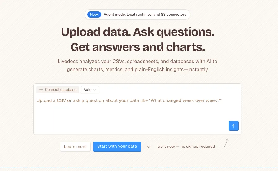
Ready to analyze your data?
Upload your CSV, spreadsheet, or connect to a database. Get charts, metrics, and clear explanations in minutes.
No signup required — start analyzing instantly