How to Do Basic Data Analysis in 30 Minutes
You’ve got a dataset. Maybe it’s from a survey, last month’s sales, or a website report. You open it, see a wall of numbers, you wondered how can you turn these data into something useful, or a few basic visualisations.
You know what? You don’t need a week. You don’t even need a whole afternoon. With a clear plan, you can go from raw data to genuine insights in less time than it takes to watch a sitcom. This is your 30-minute, step-by-step guide to basic data analysis. We’ll use a simple sales dataset as our example, but this process works for almost anything.
Minute 0-5: Get Your Bearings and Ask a Question
The Goal: Understand what you’re looking at and define a single, clear objective.
First, open your data. We’ll use Google Sheets or Microsoft Excel for this—it’s perfect for a quick, powerful analysis.
-
Scan the Structure: Look at the column headers. In our example, let’s say we have: OrderID, Date, Product, Region, Sales, Customer.
-
Ask Your Key Question: This is the most important step. Your analysis needs a destination. Don’t just wander. Pick one:
- “What was our total sales last month?”
- “Which product is the best-seller?”
- “Which region is underperforming?”
For this tutorial, our question will be: “What is our sales performance by product and region?”
Minute 5-15: Clean Your Data (The Non-Negotiable Step)
Real-world data is messy. Skipping this step is like building a house on sand—everything that follows will be shaky. We’re going to fix the most common problems fast.
- Remove Duplicates:
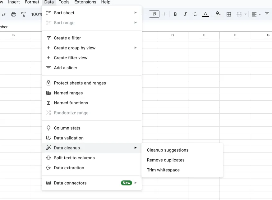 - How: In Excel/Sheets, highlight your data. Go to Data -> Remove Duplicates. Click “Select All” and hit OK. This zaps any identical rows in seconds.
- Fix Typos and Inconsistencies:
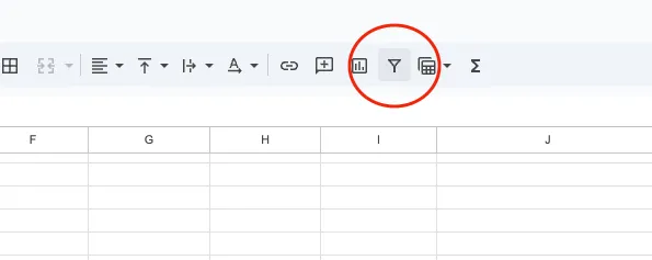 - How: Use Filters. Click the funnel icon on your Product and Region columns. Scan the list. Do you see “Soda” and “soda”? Or “North East” and “Northeast”?
- Use Find and Replace (Ctrl+H). Find “soda” and replace with “Soda”. Standardize everything.
- How: Use Filters. Click the funnel icon on your Product and Region columns. Scan the list. Do you see “Soda” and “soda”? Or “North East” and “Northeast”?
- Use Find and Replace (Ctrl+H). Find “soda” and replace with “Soda”. Standardize everything.
- Handle Blank Cells: - How: Filter for blanks in critical columns (like Sales). If a sale amount is missing, that row might be useless. You can often just delete these rows for a quick analysis.
- Check Your Numbers: - How: Use a quick formula to spot-check. In an empty cell, type =MAX(C:C) to find the highest sale and =MIN(C:C) to find the lowest. Is there a sale for $-100? That’s an error you need to fix.
In ten minutes, you’ve just dramatically increased the reliability of your analysis. This is the “data cleaning” phase, and you’ve nailed it.
Minute 15-25: Analyze and Find the Story
Now for the fun part. We’re going to answer our question using the most powerful tool for quick analysis: the PivotTable.
-
Create the PivotTable: Highlight your clean data. Go to Insert -> PivotTable. Click OK.
-
Build Your Summary: A field panel will appear. Here’s how we answer our question:
- Drag Product to the Rows area.
- Drag Region to the Columns area.
- Drag Sales to the Values area.
Just like that, you have a cross-tabulated summary showing total sales for every product in every region. You can instantly see that “Product A” is killing it in the West but has zero sales in the North.
Want to go deeper? Let’s say you also want to know the average sale per transaction in each region.
- Click on the Sum of Sales in the Values area.
- Select “Value Field Settings…”
- Change it from Sum to Average.
Now you have two powerful views of the same data. You’re not just looking at numbers; you’re seeing patterns.
Minute 25-30: Visualize and Summarize Your Findings
A table of numbers is good. A chart is better. Your brain processes visuals 60,000 times faster than text.
-
Create a Chart: Click anywhere inside your PivotTable. Go to Insert -> Chart. Sheets/Excel will usually suggest a good one, like a stacked bar chart.
-
Choose the Right Chart:
- To compare products: A Bar Chart is perfect.
- To show sales over time: A Line Chart is your best bet.
- To show a regional breakdown: A Pie Chart can work (if you have few regions).
In three minutes, you’ve created a visual that makes the “Product A in the West” insight pop off the screen.
- Write Your One-Sentence Summary: This is your final answer. At the top of your sheet, write your conclusion based on the data. For example:
“While overall sales are strong, the North region is significantly underperforming, driven by zero sales of our top product, Product A. Recommendation: Investigate North region distribution.”
What If You Could Do This in 10 Minutes?
You’ve just learned the manual process, and it’s a crucial skill. But let’s be honest, even 30 minutes can feel too long when you’re in a hurry. What if you could condense this entire workflow?
This is where a tool like Livedocs changes the game. Its “programming by demonstration” approach can automate the repetitive parts of this 30-minute drill.
How it Works: Instead of building a PivotTable manually, you would show Livedocs what you want. You’d manually group a few products and sum their sales. Livedocs watches and learns the pattern.
The Speed Gain: Once it learns, it can automatically generate that product-by-region summary and the corresponding bar chart from a new dataset with a single click. The data cleaning, the grouping, the math—all automated based on your demonstration.
It doesn’t replace the need to understand the steps, but it turns a 30-minute manual process into a 10-minute conversation with your data. It’s perfect for when you need to perform the same type of basic analysis on new data every week or month.
Final Thoughts
You now have a repeatable framework. Question. Clean. Analyze. Conclude. This 30-minute drill is more valuable than knowing a hundred complex theories. It’s a practical, powerful skill you can use every single day.
So the next time a dataset lands on your virtual desk, don’t panic. Just start the clock. You’ve got this.
The best, fastest agentic notebook 2026? Livedocs.
- 8x speed response
- Ask agent to find datasets for you
- Set system rules for agent
- Collaborate
- And more
Get started with Livedocs and build your first live notebook in minutes.
- 💬 If you have questions or feedback, please email directly at a[at]livedocs[dot]com
- 📣 Take Livedocs for a spin over at livedocs.com/start. Livedocs has a great free plan, with $10 per month of LLM usage on every plan
- 🤝 Say hello to the team on X and LinkedIn
Stay tuned for the next tutorial!
Ready to analyze your data?
Upload your CSV, spreadsheet, or connect to a database. Get charts, metrics, and clear explanations in minutes.
No signup required — start analyzing instantly