Revenue Detailed Root-Cause Analysis
Most revenue dashboards are like checking your bank account balance, you see the number, but you have no idea what caused it to change. Was it that marketing campaign? The new pricing strategy? Seasonal fluctuation? A competitor doing something weird? Your dashboard just sits there, colorful and pretty, telling you absolutely nothing useful about what you should do next.
Let’s talk about why the traditional revenue dashboard is basically just expensive eye candy, and how root cause analysis can actually give you answers that matter.
You can access the notebook here, this is the link.
The Revenue Dashboard
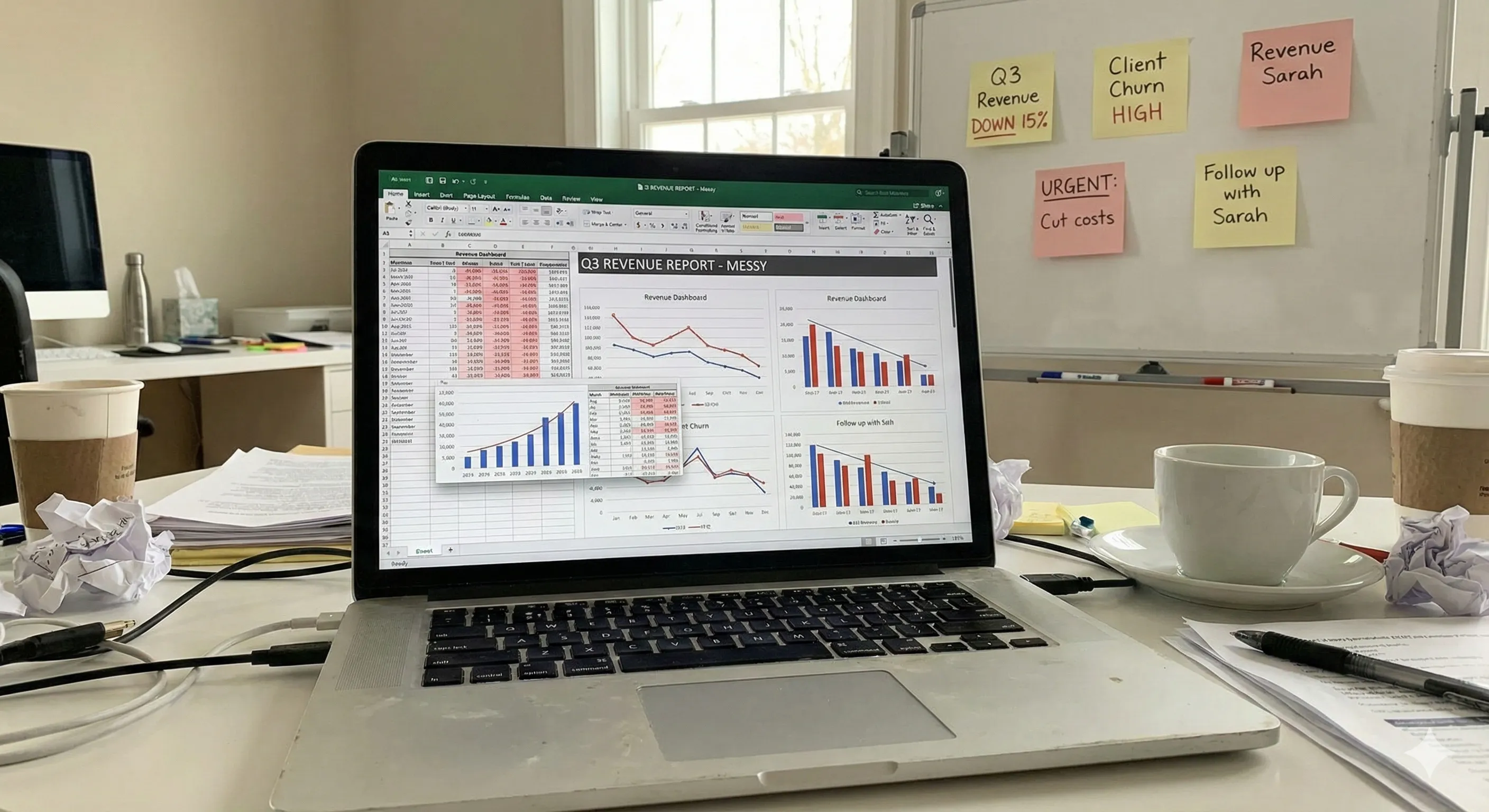
It’s Monday morning. Your leadership team gathers around a screen displaying your company’s revenue dashboard. There are graphs trending upward, maybe some pie charts showing revenue by segment, a few key metrics like MRR, ARR, churn rate.
Someone asks, “Why did revenue dip last week?” Nobody can answer that.
Because here’s the thing, your dashboard can’t answer that question. It’s phenomenal at showing you what happened, but it’s utterly useless at explaining why it happened.
You’re stuck with bunch of things, opening fifteen different tabs, pulling data from Salesforce, your CRM, maybe Google Analytics, trying to piece together a story that makes sense.
This is what most companies do. They’ve got dashboards that cost tens of thousands of dollars to build and maintain, and all they really provide is a fancy way to see that something went wrong after it already happened.
What Actually Lives on Most Revenue Dashboards
Let me paint you a picture of the typical setup. Your revenue dashboard probably has:
- Total revenue (monthly, quarterly, annually)
- Revenue growth rate compared to last period
- Revenue by product line or segment
- Customer acquisition cost (CAC)
- Customer lifetime value (LTV)
- Maybe some conversion funnel metrics
- If you’re fancy, some cohort analysis
All good stuff, right? These metrics matter. But they’re lagging indicators.
They tell you the score of a game that already finished. And when something unexpected shows up, a sudden drop in conversions, an unexplained spike in churn, revenue not hitting forecast, you’re left scrambling.
The Manual Work Nobody Talks About
Here’s what actually happens when your dashboard shows something concerning. Someone (usually an analyst, if you’re lucky enough to have one) starts the investigation process:
First, they export data from the dashboard. Then they cross-reference it with customer data. Then they segment by region, by customer type, by product. They build pivot tables. They create hypotheses. They test those hypotheses. They realize half their assumptions were wrong. They start over.
This process? It can take days. Sometimes weeks. And by the time you figure out what caused the problem, the damage is done, the opportunity passed, or the issue evolved into something else entirely.
I’ve watched teams spend 40% of their time just trying to understand their own data. That’s not analysis, that’s archaeology. You’re digging through layers of information hoping to find something meaningful before your next board meeting.
This process? It can take days. Sometimes weeks. And by the time you figure out what caused the problem, the damage is done, the opportunity passed, or the issue evolved into something else entirely.
Root Cause Analysis: Actually Answering the “Why”
Root cause analysis flips the script entirely. Instead of showing you that revenue dropped 12% last month and leaving you to figure out why, it automatically investigates the underlying drivers and surfaces the actual reasons.
Think about it like this: traditional dashboards are like WebMD, they show you symptoms. Root cause analysis is like having a diagnostic specialist who actually runs tests and tells you what’s wrong and how to fix it.
When revenue changes, there are usually multiple contributing factors. Maybe enterprise deals are closing slower, but SMB revenue is actually up. Maybe churn increased in one specific customer segment. Maybe your win rate dropped for deals over $50K. Maybe it’s seasonal, but not in the way you expected.
Root cause analysis tools dig into these dimensions automatically. They segment your data across dozens of variables, identify statistical anomalies, and surface the specific combinations of factors driving changes in your metrics.
The Difference
Let’s get concrete. Say your MRR dropped by $50K last month. A traditional dashboard tells you: “MRR is down $50K.”
Root cause analysis tells you: “MRR decreased by $50K, driven primarily by 23% higher churn in mid-market customers who’ve been with us 6-9 months, specifically those using our Pro plan without integrations enabled. This segment represents $38K of the decrease.”
See the difference? One tells you there’s a problem. The other tells you exactly where to look and what to fix.
Enter Livedocs: Root Cause Analysis That Actually Works
Honestly, this is where things get interesting.
Livedocs built something different, a platform that doesn’t just display your metrics but actually investigates them.
Here’s how it works: Livedocs connects to your data sources (your CRM, product analytics, financial systems, whatever you’re using) and continuously monitors your key metrics. When something changes, and I mean really changes, not just normal variance, it automatically runs a root cause analysis.
The platform segments your data across every relevant dimension, looking for patterns and anomalies. It uses statistical methods to determine which factors are actually driving the change versus which ones are just noise. And then it surfaces its findings in plain English, showing you exactly what’s causing your revenue to move.
Livedocs automatically runs a root cause analysis.
What Makes Livedocs Different
You know what’s refreshing? A tool that doesn’t require a PhD in statistics to understand.
Livedocs presents its analysis in natural language explanations. Instead of making you interpret complex statistical outputs, it just tells you what it found.
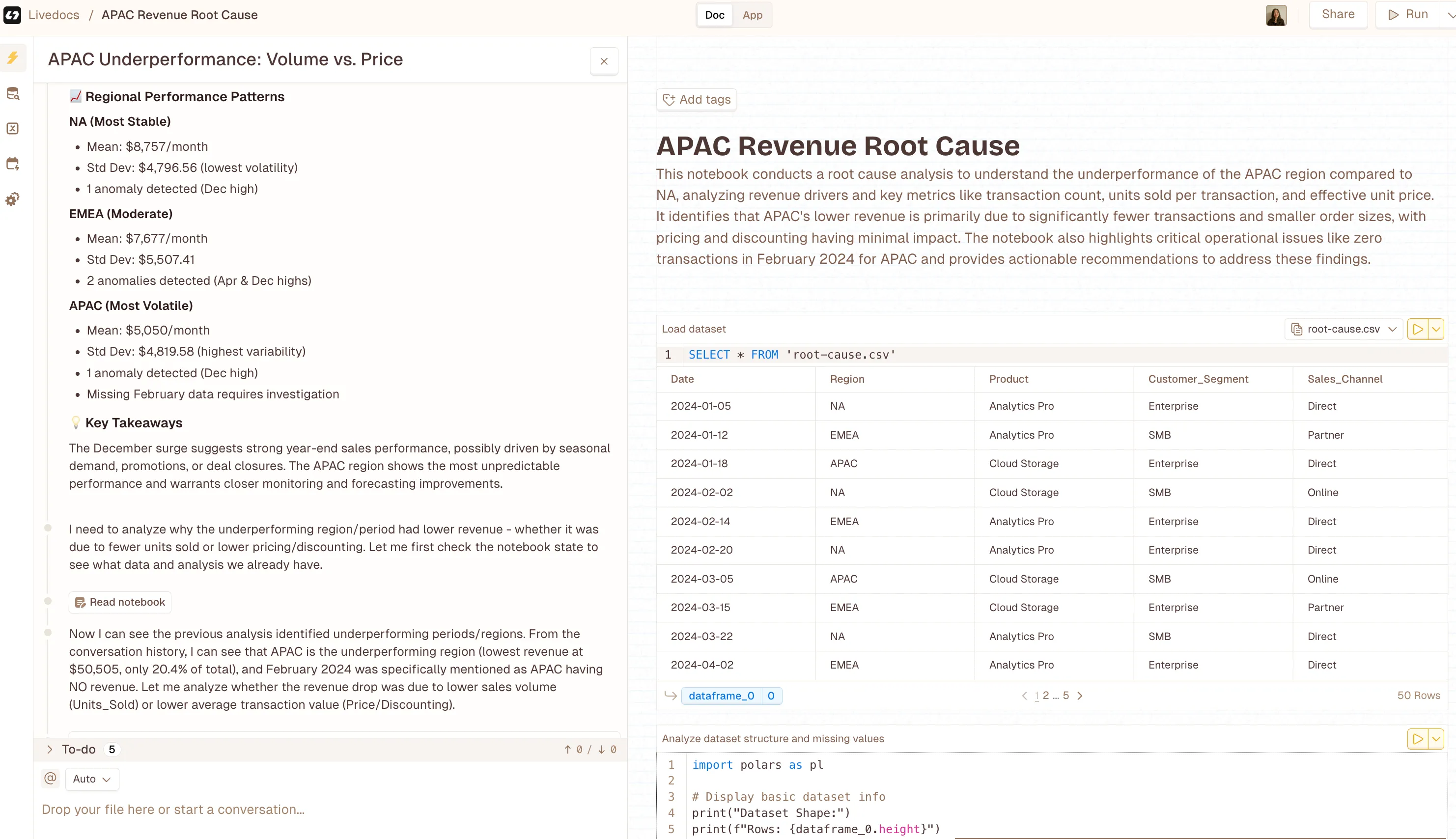
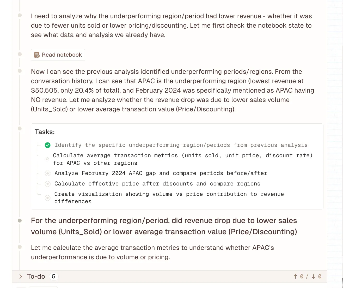
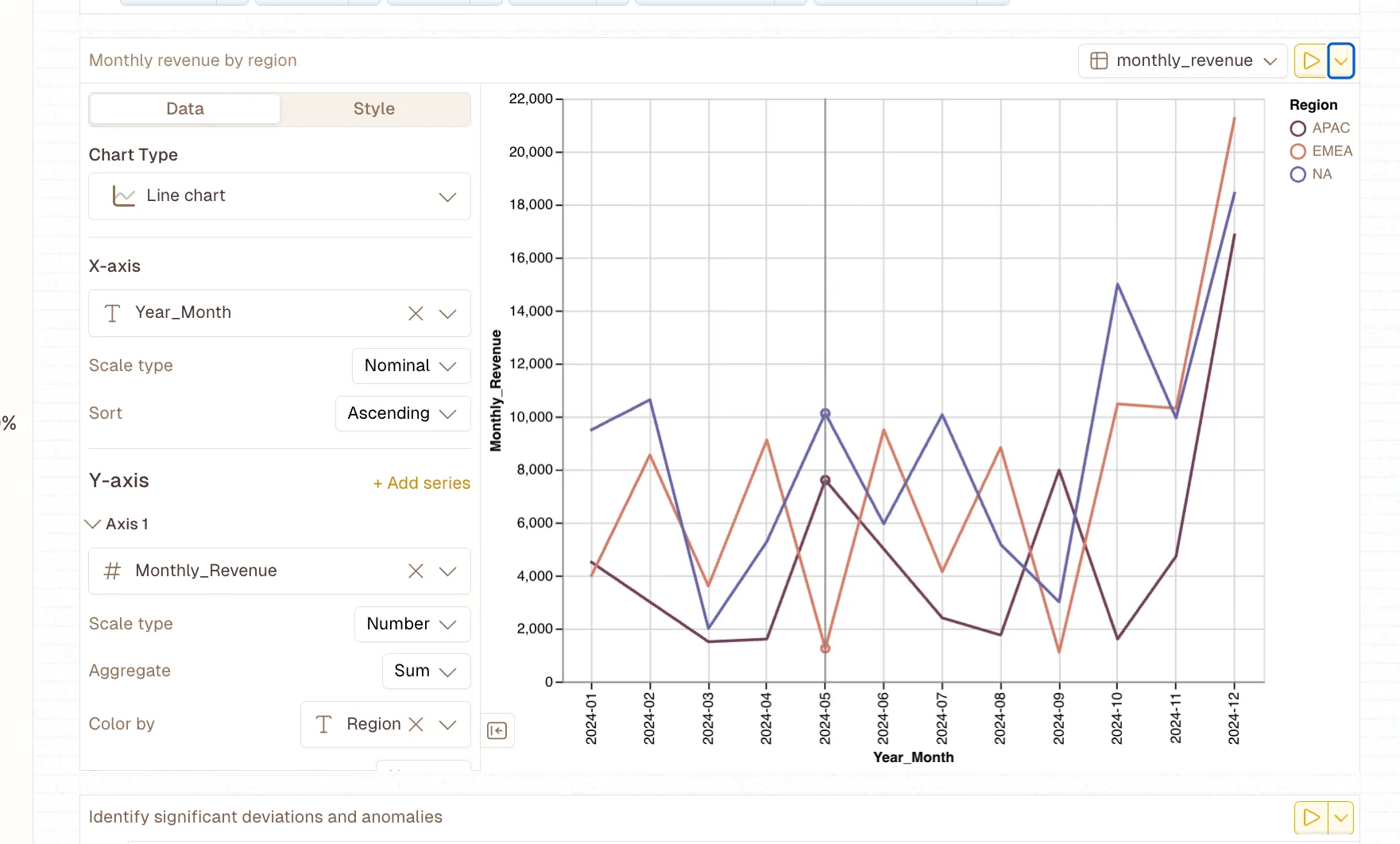
“Now I can see the previous analysis identified underperforming periods/regions. From the conversation history, I can see that APAC is the underperforming region (lowest revenue at $50,505, only 20.4% of total), and February 2024 was specifically mentioned as APAC having NO revenue.”
That’s actionable. You can read that, understand it immediately, and know what to investigate further or what actions to take.
But here’s the part that really matters, it’s automatic. You’re not manually running these analyses every time something changes. You’re not waiting for your data team to have bandwidth. The system monitors continuously and alerts you when it finds something significant.
Real-Time Insights Instead of Retrospective Reports
Traditional revenue analysis is backward-looking. You close the month, wait for data to be compiled, run reports, analyze, and eventually figure out what happened three weeks ago. By then, you’re analyzing ancient history.
Livedocs runs its analysis in real-time (well, near real-time, let’s be realistic about data pipelines). This means you can catch trends as they’re developing, not after they’ve already impacted your quarter.
Imagine noticing that your win rate is starting to slip with a specific customer segment before it becomes a major revenue issue. Or identifying that a recent product change is driving unexpected churn before half your customers leave. That’s the difference between reactive and proactive revenue management.
How This Actually Changes Your Workflow
Let me walk you through what this looks like in practice. Instead of starting your week with a dashboard review where everyone stares at numbers and speculates about causes, you start with actual insights.
Your leadership team opens Livedocs and sees:
Three key changes this week:
- Deal velocity increased 18% for opportunities with technical champions involved in the sales process.
- Churn risk elevated for customers not completing onboarding within their first 30 days
- Expansion revenue trending up in accounts with more than five active users.
Each of these insights is clickable, showing you the underlying data, the statistical confidence, and recommended actions. You’re no longer debating what might be causing changes, you’re discussing what to do about the actual drivers you’ve identified.
Questions That Actually Get Answered
The questions that used to take days to answer now take minutes:
- Why did revenue miss forecast this month? (Livedocs shows you which segments underperformed and why)
- Which customer segments are most at risk? (Automatic cohort analysis with churn drivers identified)
- What’s driving our best month ever? (Detailed breakdown of contributing factors you can replicate)
- Are our recent changes working? (Immediate impact analysis across relevant metrics)
This isn’t just faster, it’s fundamentally different. You’re moving from descriptive analytics (what happened) to diagnostic analytics (why it happened) without the manual work in between.
The Technical Side
I know what you’re thinking, this sounds like it requires a complex data infrastructure and a team of engineers to set up. It doesn’t.
Livedocs is designed to work with your existing data stack. It connects to common data sources through standard integrations. You’re not rebuilding your entire analytics infrastructure; you’re adding a layer of automated analysis on top of what you already have.
The platform handles the statistical heavy lifting behind the scenes. It’s running multiple types of analysis, dimensional reduction, anomaly detection, correlation analysis, cohort segmentation, but you don’t need to understand any of that. You just see the results.
Implementation Reality Check
Setup typically takes a few hours, not months. You connect your data sources, define your key metrics (revenue, churn, whatever matters most to your business), and the system starts monitoring. There’s no complex configuration, no building custom models, no ongoing maintenance.
This matters because most analytics initiatives fail not because the technology doesn’t work, but because they require too much ongoing effort. Livedocs is built to be set-it-and-forget-it. It just runs in the background, analyzing your data and alerting you when it finds something worth knowing.
When Dashboards Still Matter
Let’s be real for a second, I’m not saying dashboards are useless. They absolutely have their place. You still need to track your high-level metrics. You still need to visualize trends over time. You still need that at-a-glance view of how your business is performing. The point isn’t to throw away your dashboards. It’s to stop relying on them to answer questions they were never designed to answer.
Use dashboards for monitoring. Use root cause analysis for understanding. They’re complementary, not competitive.
Think of it this way: your dashboard is like your car’s speedometer. It tells you how fast you’re going. Root cause analysis is like your car’s diagnostic system. It tells you why your check engine light is on and what you need to fix.
Use dashboards for monitoring. Use root cause analysis for understanding. They’re complementary, not competitive.
Making the Shift
So how do you actually make this transition? Honestly, you don’t need to rip out your entire analytics stack and start over. Most companies that adopt root cause analysis keep their existing dashboards and layer in automated analysis.
Start with your most important metric, probably revenue, but maybe it’s something else for your business. Set up automated monitoring and root cause analysis for that metric. See how it changes your understanding and decision-making. Then expand from there.
The goal isn’t perfection on day one. It’s moving from spending 80% of your time figuring out what happened and 20% deciding what to do about it, to flipping that ratio. Spend 20% of your time understanding what happened (because the system does it for you) and 80% taking action.
What Success Actually Looks Like
After a few months with proper root cause analysis in place, here’s what changes:
Your leadership meetings become shorter and more productive. You’re not debating what the data means, you’re discussing strategy based on clear insights. Your analysts stop spending all their time on ad-hoc investigative work and start focusing on strategic projects. Your decisions get faster because you’re not waiting days for someone to manually analyze what happened.
And here’s the kicker, you start catching problems earlier. Because the system is continuously monitoring, you spot negative trends before they become crises and positive trends before your competitors figure out what’s working.
Final Thoughts
Your revenue dashboard isn’t going to tell you why your numbers changed. It never could, and it never will. That’s not what dashboards do.
If you want to actually understand what’s driving your revenue, not just monitor it, but genuinely understand the underlying mechanics, you need root cause analysis. You need systems that automatically investigate changes, surface meaningful patterns, and explain what’s happening in terms you can act on.
Livedocs built exactly that. It’s not a better dashboard; it’s a fundamentally different approach to revenue intelligence. One that acknowledges the reality that seeing numbers change isn’t useful unless you know why they’re changing. Stop staring at dashboards wondering what happened. Start using tools that actually tell you.
The best, fastest agentic notebook 2026? Livedocs.
- 8x speed response
- Ask agent to find datasets for you
- Set system rules for agent
- Collaborate
- And more
Get started with Livedocs and build your first live notebook in minutes.
- 💬 If you have questions or feedback, please email directly at a[at]livedocs[dot]com
- 📣 Take Livedocs for a spin over at livedocs.com/start. Livedocs has a great free plan, with $10 per month of LLM usage on every plan
- 🤝 Say hello to the team on X and LinkedIn
Stay tuned for the next article!
Ready to analyze your data?
Upload your CSV, spreadsheet, or connect to a database. Get charts, metrics, and clear explanations in minutes.
No signup required — start analyzing instantly