Running Monte Carlo Simulations in Python
The fact that casinos accidentally gave us one of the most powerful tools in computational finance. Monte Carlo simulations, named after that famous gambling hotspot in Monaco, have become the go-to method for anyone trying to predict outcomes when uncertainty is involved.
And honestly? They’re not nearly as complicated as they sound.
I’ve been running these simulations for years now, and I’m still amazed at how a relatively simple concept can help you tackle everything from stock price predictions to risk assessment. Let me walk you through how to actually build one in Python, and why I’ve started using Livedocs for this kind of work.
What Exactly Is a Monte Carlo Simulation Anyway?
Before we jump into code, let’s make sure we’re on the same page. A Monte Carlo simulation is basically a way to model uncertainty by running tons of random scenarios. Think of it like this: instead of trying to predict one future, you’re simulating thousands of possible futures and seeing what patterns emerge.
Say you’re trying to figure out whether your retirement savings will last. There are so many variables, market returns, inflation, how long you’ll live, unexpected expenses. Rather than making one prediction (which is probably wrong), you run 10,000 simulations with slightly different assumptions each time.
Why Python Makes This Ridiculously Easy
Here’s the thing about Monte Carlo simulations: they involve a lot of repetitive calculations. Like, a LOT. And that’s exactly where Python shines. The combination of NumPy for fast numerical computing and libraries like pandas for data manipulation means you can run thousands of iterations in seconds.
But there’s a catch, and this is where things used to frustrate me. Writing the code is one thing. Sharing your results with non-technical teammates? That’s where it gets messy. You end up exporting CSV files, making charts in Excel, writing separate documentation… it’s a whole thing.
That’s actually why I’ve been gravitating toward Livedocs lately. It’s this collaborative workspace that combines Python notebooks with data visualization and narrative text all in one place.
You write your simulation code, generate your charts, and explain what it all means without ever leaving the platform. Your marketing team can actually see what you’re doing in real-time without you having to translate everything into PowerPoint.
Setting Up Your Environment
First, you’ll need a few Python libraries:
import numpy as np
import pandas as pd
import matplotlib.pyplot as plt
from scipy import stats
If you’re working in Livedocs, this is already set up for you, one of those small conveniences that adds up over time. The platform runs on powerful hardware, so you don’t have to worry about your laptop fan spinning up like a jet engine when you’re running 100,000 simulations.
A Simple Example: Simulating Stock Prices
Alright, let’s build something practical. We’ll simulate potential stock price paths using geometric Brownian motion. Sounds fancy, but it’s actually pretty straightforward.
# Starting parameters
initial_price = 100  # Starting stock price
days = 252  # One trading year
mu = 0.10  # Expected annual return (10%)
sigma = 0.20  # Annual volatility (20%)
simulations = 10000  # Number of paths to simulate

# Set random seed for reproducibility
np.random.seed(42)

# Time increment
dt = 1/days

# Create a matrix to store all price paths
price_paths = np.zeros((days, simulations))
price_paths[0] = initial_price

# Run the simulation
for t in range(1, days):
    # Generate random returns
    random_shocks = np.random.normal(0, 1, simulations)

    # Calculate daily returns using GBM formula
    daily_returns = (mu/days) + sigma * np.sqrt(dt) * random_shocks

    # Update prices
    price_paths[t] = price_paths[t-1] * np.exp(daily_returns)
Livedocs runs on powerful hardware, so you don’t have to worry about your laptop fan spinning up like a jet engine when you’re running 100,000 simulations.
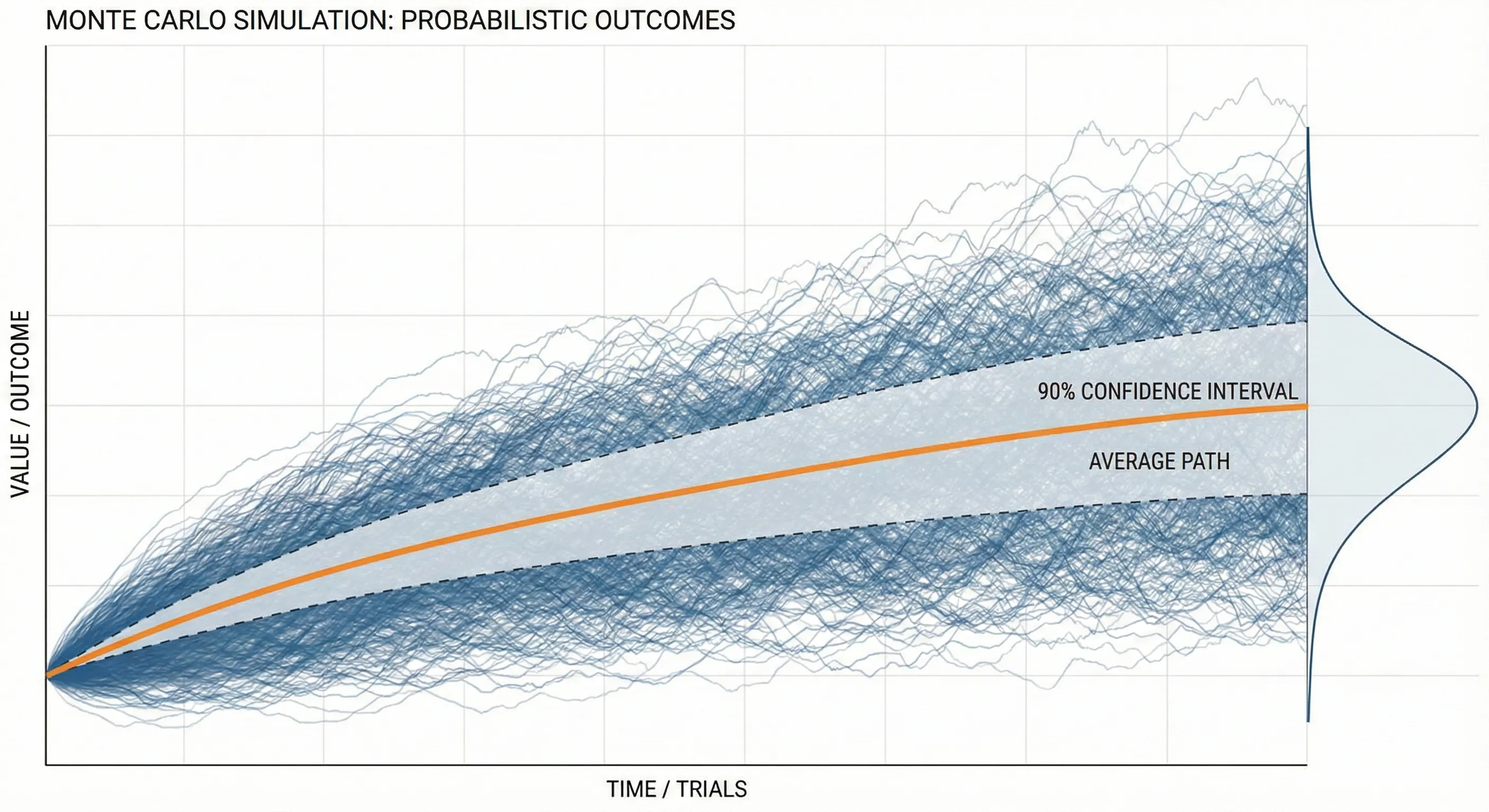
This code generates 10,000 different possible price paths for a stock over one year. Each path is slightly different because of those random shocks we’re introducing.
Making Sense of the Results
Now here’s where it gets interesting. You’ve got 10,000 different outcomes sitting in that array. What do you do with them?
# Calculate final prices
final_prices = price_paths[-1]

# Get some statistics
mean_final_price = np.mean(final_prices)
median_final_price = np.median(final_prices)
percentile_5 = np.percentile(final_prices, 5)
percentile_95 = np.percentile(final_prices, 95)

print(f"Mean final price: ${mean_final_price:.2f}")
print(f"Median final price: ${median_final_price:.2f}")
print(f"5th percentile: ${percentile_5:.2f}")
print(f"95th percentile: ${percentile_95:.2f}")
What you’re looking at here is a range of outcomes. That 5th to 95th percentile range? That’s telling you where 90% of your simulated outcomes landed. It’s not a guarantee, nothing ever is, but it gives you a realistic sense of the possibilities.
In Livedocs, you can turn this into an interactive dashboard where stakeholders can adjust the input parameters themselves. Change the volatility, see how it affects the outcomes. It’s this kind of exploratory analysis that used to require a data scientist to be in the room for every question.
Visualizing Your Monte Carlo Results
Numbers are great, but let’s be real, most people’s eyes glaze over when you start rattling off percentiles. This is where visualization saves the day.
# Create a histogram of final prices
plt.figure(figsize=(12, 6))

plt.subplot(1, 2, 1)
plt.hist(final_prices, bins=50, edgecolor='black', alpha=0.7)
plt.axvline(mean_final_price, color='red', linestyle='--',
            label=f'Mean: ${mean_final_price:.2f}')
plt.axvline(percentile_5, color='orange', linestyle='--',
            label=f'5th percentile: ${percentile_5:.2f}')
plt.axvline(percentile_95, color='green', linestyle='--',
            label=f'95th percentile: ${percentile_95:.2f}')
plt.xlabel('Final Stock Price ($)')
plt.ylabel('Frequency')
plt.title('Distribution of Final Stock Prices')
plt.legend()

# Plot a sample of price paths
plt.subplot(1, 2, 2)
for i in range(100):  # Just plot 100 paths so it's readable
    plt.plot(price_paths[:, i], alpha=0.1, color='blue')
plt.xlabel('Trading Days')
plt.ylabel('Stock Price ($)')
plt.title('Sample Price Paths')

plt.tight_layout()
plt.show()
This gives you two views: a histogram showing where final prices cluster, and a spaghetti plot of individual price paths. Both tell important stories.
When Things Get More Complex
Real-world problems are messier than our stock price example. You might need to simulate multiple correlated assets, incorporate mean reversion, or add jumps to account for market crashes. That’s when things get interesting, and when having a proper workspace becomes crucial.
Let’s say you want to simulate a portfolio with three assets that are correlated with each other:
# Define correlation matrix
correlation_matrix = np.array([
    [1.0, 0.6, 0.3],
    [0.6, 1.0, 0.4],
    [0.3, 0.4, 1.0]
])

# Cholesky decomposition for correlated random variables
chol = np.linalg.cholesky(correlation_matrix)

# Number of assets
n_assets = 3
returns = np.zeros((days, simulations, n_assets))

for t in range(1, days):
    # Generate independent random shocks
    independent_shocks = np.random.normal(0, 1, (n_assets, simulations))

    # Apply correlation structure
    correlated_shocks = chol @ independent_shocks

    # Calculate returns for each asset
    for i in range(n_assets):
        daily_return = (mu/days) + sigma * np.sqrt(dt) * correlated_shocks[i]
        returns[t, :, i] = daily_return
You know what’s great about doing this in Livedocs? You can add SQL queries to pull in real market data, use Python for the simulation logic, create interactive charts, and write explanatory text, all in the same document.
Common Pitfalls
Let me save you some headaches. First, always set a random seed if you want reproducible results. Nothing’s worse than getting great results, showing them to your team, then running the code again and getting completely different numbers because you forgot np.random.seed().
Second, be careful with your time scales. If you’re using annual parameters but simulating daily movements, you need to adjust them properly. That dt = 1/days in our code? That’s not just decoration, it’s scaling your annual volatility down to daily.
Third, and this one took me embarrassingly long to learn, more simulations aren’t always better. Yeah, 1,000,000 simulations will give you smoother distributions than 1,000. But if your model assumptions are wrong, you’re just getting a more precise wrong answer. Sometimes it’s better to run fewer simulations but test different assumptions.
Making It Interactive
Here’s where platforms like Livedocs really shine. Instead of hardcoding all your parameters, you can create what they call “dynamic documents” where users can adjust inputs and see results update instantly.
# In LiveDocs, you can create parameter controls
# that non-technical users can adjust

def run_monte_carlo(initial_price, mu, sigma, days, sims):
    """
    Flexible Monte Carlo function that can be called
    with different parameters
    """
    np.random.seed(42)
    dt = 1/days
    price_paths = np.zeros((days, sims))
    price_paths[0] = initial_price

    for t in range(1, days):
        shocks = np.random.normal(0, 1, sims)
        returns = (mu/days) + sigma * np.sqrt(dt) * shocks
        price_paths[t] = price_paths[t-1] * np.exp(returns)

    return price_paths

# Now anyone can run scenarios without touching code
results = run_monte_carlo(
    initial_price=100,
    mu=0.15,  # Try different expected returns
    sigma=0.25,  # Try different volatility levels
    days=252,
    sims=10000
)
The difference between sharing a static PDF report and sharing an interactive document where people can explore different scenarios themselves? It’s night and day. Suddenly you’re not the bottleneck for every “what if” question that comes up.
Real-World Applications Beyond Finance
Monte Carlo simulations aren’t just for Wall Street types. I’ve used them for:
- Supply chain optimization: Simulating demand variability and lead times to figure out optimal inventory levels
- Project planning: Modeling task duration uncertainty to predict realistic project completion dates
- A/B testing: Estimating the probability that one variant is truly better than another
- Customer lifetime value: Simulating churn rates and purchase behavior over time
The basic technique is the same, you’re just swapping out the underlying model.
Performance Tips
When you’re running tens of thousands of simulations, speed matters. Here are some tricks:
Use NumPy’s vectorized operations instead of loops whenever possible. That means working on entire arrays at once rather than one element at a time. In our stock price simulation, notice how we generated all the random shocks at once for each time step? That’s way faster than looping through each simulation individually.
# Slow way (don't do this)
for sim in range(simulations):
    for t in range(1, days):
        shock = np.random.normal(0, 1)
        price_paths[t, sim] = price_paths[t-1, sim] * np.exp(...)

# Fast way (do this)
for t in range(1, days):
    shocks = np.random.normal(0, 1, simulations)
    price_paths[t] = price_paths[t-1] * np.exp(...)
Another thing: if you’re running really massive simulations, consider using numba to JIT-compile your Python code. It can give you 10-100x speedups with minimal code changes.
Validating Your Simulations
Here’s something that doesn’t get talked about enough: how do you know your simulation is actually working correctly?
Start by running simple scenarios where you know the theoretical answer. For a geometric Brownian motion with zero drift, your expected final price should equal your starting price (on average). Run your simulation and check, if the mean final price is way off, something’s broken.
# Validation test
test_results = []
for _ in range(100):
    paths = run_monte_carlo(
        initial_price=100,
        mu=0,  # Zero drift
        sigma=0.2,
        days=252,
        sims=10000
    )
    test_results.append(np.mean(paths[-1]))

print(f"Mean of means: {np.mean(test_results):.2f}")
print(f"Should be close to: 100.00")
If that mean isn’t hovering around 100, you’ve got a bug somewhere.
Final Thoughts
Monte Carlo simulations are one of those techniques that seem intimidating until you actually build one. Then you realize it’s just random numbers and basic math, lots of it, sure, but nothing magical.
The real challenge isn’t the code. It’s making your analysis accessible and collaborative. That’s why I’ve been leaning into tools like Livedocs. When your entire workflow, data import, analysis, visualization, and documentation, lives in one place, you spend less time wrestling with toolchains and more time actually solving problems.
Being able to share an interactive document where someone can play with parameters and immediately see results has changed how I communicate complex analyses. Instead of being the person who generates reports that get questioned, you’re enabling others to explore the problem space themselves.
So yeah, Monte Carlo simulations in Python. They’re powerful, they’re not as hard as you think, and with the right workspace, they’re something you can actually collaborate on rather than working in isolation.
The best, fastest agentic notebook 2026? Livedocs.
- 8x speed response
- Ask agent to find datasets for you
- Set system rules for agent
- Collaborate
- And more
Get started with Livedocs and build your first live notebook in minutes.
- 💬 If you have questions or feedback, please email directly at a[at]livedocs[dot]com
- 📣 Take Livedocs for a spin over at livedocs.com/start. Livedocs has a great free plan, with $10 per month of LLM usage on every plan
- 🤝 Say hello to the team on X and LinkedIn
Stay tuned for the next article!
Ready to analyze your data?
Upload your CSV, spreadsheet, or connect to a database. Get charts, metrics, and clear explanations in minutes.
No signup required — start analyzing instantly