A Beginner's Guide for Data Storytelling.
Let’s talk practical for a minute. You don’t need a PhD in statistics or a six-figure budget to start telling better data stories. Easy, just upload your data to Livedocs, ask our agent to build a live dashboard around it!
But what differentiates an average data scientist vs an outstanding one, it’s the ability to tell great story behind those data and numbers.
—
What is Data Storytelling? A Beginner’s Guide to Turning Data into Insights
You know that moment when you’re staring at a spreadsheet full of numbers, and your brain just, shuts down? Yeah, we’ve all been there. Raw data can feel like trying to read hieroglyphics sometimes, technically meaningful, but practically useless if you can’t make sense of it.
That’s where data storytelling comes in, and honestly, it’s one of those skills that can completely change how you communicate at work.
So What Exactly Is Data Storytelling?
Data storytelling is the art of combining data analysis with narrative techniques to communicate insights in a way that actually sticks. Think of it as translating numbers into human language, taking those cold, hard facts and wrapping them in context, emotion, and meaning.
It’s not just about making pretty charts (though those help).
It’s about answering the “so what?” question that everyone’s thinking but afraid to ask.
Let me put it this way: imagine you’re explaining to your grandmother why your company’s revenue dropped 15% last quarter.
You wouldn’t just show her a bar chart and walk away, right? You’d tell her the story, maybe how the supply chain issues hit, how customer behavior shifted, and what you’re doing about it.
The Three Pillars That Make Stories Stick
Here’s the thing about effective data storytelling, it rests on three key elements that work together like a well-oiled machine.
Data (The Foundation) - This is your evidence, your proof. Without solid data, you’re just telling fairy tales.
But here’s where people get it wrong, more data doesn’t automatically mean better storytelling. Sometimes less is more.
Narrative (The Structure) - Every good story has a beginning, middle, and end. Your data story should too.
Start with context, present the conflict (your key insight), and conclude with resolution (what to do next).
Visualization (The Vehicle) - This is how you deliver your message. Charts, graphs, dashboards, these aren’t just decorations.
They’re your storytelling tools, and choosing the right one can make or break your narrative.
Why Your Boss (And Everyone Else) Needs to Hear This
Let’s be real for a second.
Most people make decisions based on gut feeling, not spreadsheets. That’s not necessarily bad, human intuition is powerful. But when you can combine that intuition with compelling data stories, magic happens.
Data storytelling helps you:
- Get buy-in for your ideas (because stories are persuasive)
- Make complex information digestible
- Drive action instead of just generating reports
- Build trust through transparency
Think about the last time someone presented data to you.
Did they just flash numbers on a screen, or did they walk you through a journey?
The latter probably stuck with you longer.
From Numbers to Narratives: Your Step-by-Step Playbook
Start with the Question, Not the Data
This might sound backwards, but hear me out. Before you even open that CSV file, ask yourself: what decision are we trying to make? What problem are we solving? Starting with a clear question keeps you focused and prevents that all-too-common “analysis paralysis.”
Find Your Main Character
Every story needs a protagonist. In data storytelling, this could be your customer, your product, your market, whoever or whatever your data is really about. Once you’ve identified your main character, everything else falls into place.
Look for the Plot Twist
The best data stories have that “aha!” moment, something unexpected or counterintuitive that challenges assumptions. Maybe your highest-spending customers aren’t your most profitable ones. Maybe that marketing campaign everyone loved actually drove the wrong kind of traffic.
Choose Your Adventure (Visualization)
Now comes the fun part, deciding how to show your story. Bar charts for comparisons, line graphs for trends, heat maps for patterns. But here’s a pro tip: the fanciest visualization isn’t always the best one. Sometimes a simple table gets the job done better than a complex dashboard.
Tools That Actually Make Life Easier
As I have mentioned, you don’t need a PhD in statistics or a six-figure budget to start telling better data stories.
Tableau and Power BI are the heavy hitters, powerful but with steep learning curve. Google Data Studio is more approachable and plays nice with other Google tools. For quick and dirty visualizations, even Excel can work wonders if you know what you’re doing.
But here’s where things get interesting. Tools like Livedocs are changing the game by making data storytelling more collaborative and dynamic.
Instead of static reports that become outdated the moment you hit send, you can create living documents that update automatically and allow teams to explore data together in real-time.
Here is how:
Building your first live dashboard in 3 easy steps
- If you haven’t, sign up for an account Livedocs.
- Once signed up, you will see a the “Create doc” button, click on it.
- Next, upload your data in CSV file, or connect with your database.
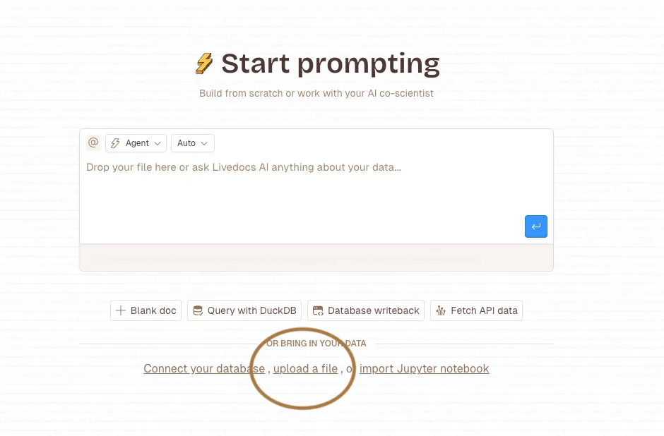
- Ask our AI Agent to analyse and create a live dashboard for you.
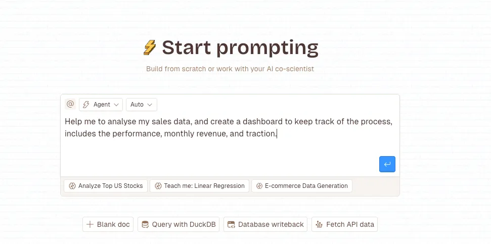
- 🎉 And after awhile, nd our agent will generate the whole dashboard for you!
- Feel free to add extra charts, any Python code or extra tables, SQL query.
- Once ready, hit the “Publish” button on the top right corner.
- And now you are ready to share your data with your team or investors!
—
Making Your Data Stories Stick
Here’s something I learned the hard way: the most brilliant insight in the world is worthless if nobody remembers it five minutes after your presentation ends.
To make your data stories memorable, try these techniques:
Use analogies that connect to your audience’s experience.
- Explaining server load? Compare it to traffic congestion.
- Showing customer churn? Think of it like a leaky bucket.
- Include specific details that paint a picture. Instead of “sales increased significantly,” try “sales jumped 34% after we added the new checkout feature, that’s an extra $100,000 in revenue last month alone.”
End with a clear call to action. Don’t make your audience guess what you want them to do with your insights.
Final Thoughts
Look, data storytelling isn’t rocket science, but it is a skill. And like any skill, it gets better with practice. Start small, maybe take that monthly report you’ve been sending and try adding one story element to it. Ask yourself what narrative thread connects your numbers.
The goal isn’t to become a data visualization artist overnight. It’s to become someone who can turn information into understanding, numbers into action, and data into decisions that actually matter.
The fastest way to build a live dashboard in 2026? Livedocs.
- Instant data connections
- Drag-and-drop editor
- Real-time updates
- Easy sharing
Get started with Livedocs and build your first live dashboard in minutes.
—
- 💬 If you have questions or feedback, please email directly at a[at]livedocs[dot]com
- 📣 Take Livedocs for a spin over at livedocs.com/start. Livedocs has a great free plan, with $10 per month of LLM usage on every plan
- 🤝 Say hello to the team on X and LinkedIn
Stay tuned for the next tutorial!
Ready to analyze your data?
Upload your CSV, spreadsheet, or connect to a database. Get charts, metrics, and clear explanations in minutes.
No signup required — start analyzing instantly